Have been working again with TVP. However this time, am using it for traditional 2D animation purposes.
I've got an idea in mind for the process for the film. I'd love to do it all hand drawn, and that is a possibility, however here's what im currently thinking:
1) Draw the keys on paper, in pastel; scan em
2) Import keyframes to TVP, use a set of custom brushes to do the inbetweens with, making it look like its been done on paper in pastel.
3) Do the 'detail work' over the top of the key's and inbetweens, this'll be the character details.
--
Using TVP has been a bit cack-handed mind. Like I said need to get to grips with it before I can commit to using it.
If not, i've got some other ideas in mind. Because the characters are built out of shapes, i'm considering doing 'rough' animation in flash/toonboom as it's good with shapes/tweens. What I can do is map out the action in there simply, then draw in the details over the top in TVP. I think this could create quite a nice style as the geometric shapes will exist under a 'handdrawn 2D skin'. Kinda like a modern day pentimento effect.
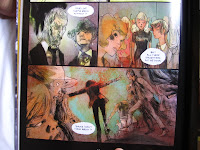
Here's a few bits of inspiration as I try to chisel down the style:
Im a big fan of rough animation. Perhaps it's a view formed through lazyness, but I often think, why don't we (animators) just output a film in the style of rough animation? It looks nice to see the pencil strokes.
This is a nice reference, however it's very typically Disney, so as an antidote...:
Gotta love Joanna Quinn. Don't know whether i'm envious or inspired.
Joanna's animation has the fluidity & roughness that is perfect as a reference. However, I get the sense that it'd be wrong to try to imitate her style, . But if we just take from it that roughness & fluidness, we have a good basis to recall.
I think another problem is - Joanna's just to good. The perfectionism of her own style is not something I want to try to imitate. It's too high a bar to set right now - I want to be realistic with it. Not doubting the ability of myself & the other animators, but realistic of the time frame & events to tackle.
Im sure with time we could make our own 'Joanna Quinn production', but what's the use in imitating?
This animation offers a good antidote to the above.
I've always noticed in my life drawings, that I'll draw a rough body - people will look at it and its average, but then put in a few head details, and people look at it and they think it's great. (eg)
Basically a bit of detail on the important bits, and the rest of the picture is sold.
I think this same theory applies to this animation. It's mainly done in silhouettes (which is alot quicker to animate as I discovered last year on Swing Heil..!) but there's brief snippets of detailed close up animation that are especially fancy to look at, that raise the bar of the rest of it.
Im considering maybe using this same idea. The characters have good geometric silouettes, so it may be fun to have them in more blocky detail than to go all 'Joanna Quinn' on every shot.
Oh, and this.
EDIT - Another:
The animation style of this somewhat contradict's referencing the above hand drawn stuff as this is much more clean cut, it doesn't have the shaky lines of Joanna Quinn or the obvious-pencil marks. However what i like about this is 1)its style - the colours, the characters 2) the pacing of it, the character development 3) the animation style. Altho it's contradictory, I really admire it.
Saying that, I admire Lapis, but I certainly dont look to imitate its style..
--
Also on the project, got Hughey on board to co-direct which i'm excited about. Hughey is into film and thats what he wants to do - be a director. I think it'll be good to have someone else there - to bounce ideas off of, to cross check ideas for shots with. Also for myself, so that I can focus more on the art side of things from now on.
I think sometimes also, you go to far down the rabbit hole - get to far into your own head, that it becomes overly subjective and you lose sight of the audience, and they lose sight of your intentions. Having someone else there will help me reign it in, make sure it makes sense.
Jake's also on board to produce when the time calls. As of yet, as we're still in the pre production stage, its not important for him to be doing 20 hour days for WLH... but in time jakey boy, in time.
He also made this cool mock up of the kitchen for me to story board from:
---
It's weird, i've been working all day everyday on the film pretty much, but when it comes to stuff to show, there's not alot to put on the table. It's all back end stuff - getting the script finalised - had a good talk with James Henry the other day about it - and since then have refined it, focused more on whats important and what ideas are central. The story hardens every day in my head. I've been compiling the storyboard also. Am proud of how its looking so far, the vision is coming together.
---
As an afterthought, here's some reference for the style also. Some of it is just interesting pretty pictures, and other is an attempt to gear towards a style for the film.
And inspiration for the setting :
Is there any reason to leave the house??
Brighton, Romford & Torquay via the wonderful research tool - Goo-gel'
Stay tuned fart fans


No comments:
Post a Comment