One of my favorite animations ever:

Showing posts with label life drawing. Show all posts
Showing posts with label life drawing. Show all posts
Life drawings week before last
First time i've been to life drawing for a good while. Gotta say, instantly noticed i'd got worse. I found it difficult to get what I wanted, felt like my co-ordination was way off.
I think this is 1) down to not going for ages, and 2) because i've been doing most my drawing for the last month or two on a computer, actually much of the year. I think working on a tablet has had a big effect, drawing with your palm rested down rather than your elbow in motion is quite a big difference that you don't really think about it. The drawings get better as they go on, which makes sense, me getting more used to it.
Anyway, there's my alibi. Enjoy.
In order:
Escuridao Decente - You got the style
Heleoey. Its been a constant bug-bear thing for us to keep in mind the style of the piece. It may seem a little cock handed the way we've gone about it, but the main thing is work is getting done and its not wasted time. We want to wait, a case of getting the shoe to fit the foot, once the team is fully pieced together, it makes sense for us then to work out the style proper.
Anywho here's some tests i've bin doing.
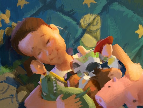
This is how I imagine the colouring to look. Its kind of what i've had in mind since day one, after seeing Migs fantastic pre production art. I like the painted look. The only problem tho; we have to make sure its simple enough to animate. I think this colouring style is quite simple, and I think a productive technique could be built up in TVP (block colouring, then shading each individual part to keep consistency, even down to individual brush strokes like we did with the Royal Wedding vid)
. I'm not sure on all aspects, the main one being line:- do we show line or not? I personally dont want to; I love the way Dice Tsutsumi paints, especially with the hard, computer-cut edge, and would love to do something in that direction.

This is a colouring test I did. Its incomplete but is getting there. I need to cut around the edge still like above, so imagine it like that.
Have got another one that i'll update the post with tomorrow.
Finally here's two little sketches we did in different styles
---
PAINTING
The animation above counts for my 4th painting (Daily painting), and the old man is the 6th. And since the clock reads half 12, here's tomorrows/todays(?.. 25th..)


---
Just want to go back to style to finish off, and include a few animations i've seen recently.
First off, just saw this:
Really love this, one watch and i'm starting to think the Sin City route may be right for us. It would be quicker to produce, very stylistic, and fun I think.
Another, which i've been blown away by this last week:
Love the looseness. I can see this flowy style of animation working for us come the end of the film when things get a bit manic.
Al also suggested the other day we take a look at 30 days of summer. Its great, it has the contrast of Sin City, but instead of it being black/white, the white bits are essentially filled in. This is essentially a coming-together of the two styles.

I dont feel its such a tough decision, I think we're pretty clear, its a case of one or the other. I feel safe in the knowledge we can stamp it 100% once the team is together and we know, realistically, what we have time for and are capable of.
Anywho here's some tests i've bin doing.
This is how I imagine the colouring to look. Its kind of what i've had in mind since day one, after seeing Migs fantastic pre production art. I like the painted look. The only problem tho; we have to make sure its simple enough to animate. I think this colouring style is quite simple, and I think a productive technique could be built up in TVP (block colouring, then shading each individual part to keep consistency, even down to individual brush strokes like we did with the Royal Wedding vid)
. I'm not sure on all aspects, the main one being line:- do we show line or not? I personally dont want to; I love the way Dice Tsutsumi paints, especially with the hard, computer-cut edge, and would love to do something in that direction.

This is a colouring test I did. Its incomplete but is getting there. I need to cut around the edge still like above, so imagine it like that.
Have got another one that i'll update the post with tomorrow.
Finally here's two little sketches we did in different styles
 |
| Waltz with Bashir colour |
 |
| Sin Cityish |
---
PAINTING
The animation above counts for my 4th painting (Daily painting), and the old man is the 6th. And since the clock reads half 12, here's tomorrows/todays(?.. 25th..)

Tis from a life drawing sesh last wednesday, coloured in PS. Felt very rewarding to do actually.
I've bought quite a few books in the last year and getting a nice little library together. One of them was Egon Schiele, & the others was of Alphonse Mucha's work. I want to have a go at immitating the two of them's styles. There approach to the opposite sex is quite different from one another (Angelic womanlyness vs prostitute demon ladies) so should be good fun.
Here's those Life Drawings from the other day too:


---
Just want to go back to style to finish off, and include a few animations i've seen recently.
First off, just saw this:
Really love this, one watch and i'm starting to think the Sin City route may be right for us. It would be quicker to produce, very stylistic, and fun I think.
Another, which i've been blown away by this last week:
Love the looseness. I can see this flowy style of animation working for us come the end of the film when things get a bit manic.
Al also suggested the other day we take a look at 30 days of summer. Its great, it has the contrast of Sin City, but instead of it being black/white, the white bits are essentially filled in. This is essentially a coming-together of the two styles.
I dont feel its such a tough decision, I think we're pretty clear, its a case of one or the other. I feel safe in the knowledge we can stamp it 100% once the team is together and we know, realistically, what we have time for and are capable of.
Life drawings - First sesh of new term
Life drawings from wednesday. Aaah feels good to be back. Instead of just uploading the good ones, im going to upload the lot from now on. Think it'll be cool to look back on at the end of the year.
Weirdly, despite not doing LD over the summer, I think i've improved. Not in practice but in thought; Have got really into the book Force & the drawing style of Michael D Mattesi. If you havent seen it already check it out (I will be returning it to the library soon so some other lucky schmuck can go nab it)

 |
| Prefer the quick 2 min sketch the the left to the actual worked up one. |


 |
| its a ghost |
------------
Life drawing
Heres my life drawing pictures from yesterday.


 I'm especially happy with the two ones drawn on black as I really like the look of them, very messy.


Life Drawings grande update
Havent posted life drawings in a while, so here's a bunch from over the last two months.


24.2.2011 - Gaz's class :


3.3.2011


10.3.2011


-----
Went to see John Cooper Clarke at the falmouth princess pavillions the other night. Was a brill night, the man is still analytical and poignant, and bloody funny! Check out this little vid I took.
Subscribe to:
Posts (Atom)