Experimental evaluation.
We were given the task of creating our own experimental animation, abiding to the modest guidelines that it must use a given audio track, and that it should use one of the many styles we've researched as a class, or perhaps one you've pioneered.
I chose to go down the stop motion route. It's an area i've only explored a little – with Anne last year in her workshop. I am a fan of making stop motion, I like the 'straight-ahead' philosophy that you have to stick to as I think it brings a freedom & spontaneity. Also, I don't have issues with patience, I can happily sit and let it enthral me for a good few hours. I find I get really into it and suddenly time has flown by.
 |
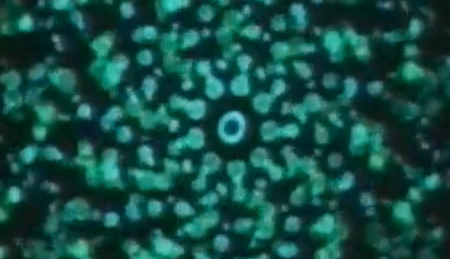
| Lapis by James Whitney |
As an influence, I wanted to use the hypnotic effects of it as a basis for my animation. The fact the camera doesn't move and stays focused on the centre spot also. To be honest there's not a lot of James Whitney's inspiration visually on my project, but it's more to do with him having pushed the barriers. If he hadn't of made something so out there, would people be making stuff in the same vein today? Would I have thought of my project, and the 'hypnotic' basis?
Another influence is Radiohead's video for 'No Surprises' (http://www.youtube.com/watch?v=sgzeqwhNTDk ) . What I find so interesting about this video is the way we are completely captivated in just watching Thom Yorke's face, speaking the lyrics to us. Despite the minor narrative (which is really what probably got people coming back and watching again), we are still happy to sit and watch him just speaking the lyrics to us. I think this is something Thom likes to toy with; when I saw them last year he did a simillar thing, where for one song he just stared deadpan directly into the lens of a camera that slowly zoomed in on him while he played some haunting piano music. Brilliant. It had a really mesmerising effect on the crowd and was probably one of the standout moments from a really visually (and audibly of course..) impressive gig.
Anywho I wanted to take that onboard – the captivating aspect of the human face. Blending that with the uncanny Valley ideals was a test – because of course the face on show in my piece wasn't real. Did it work? I'm not sure personally. I feel the uncanny valley aspect works as it comes across in shades – which is what I wanted – that beginning eeriness and uncomfortable feeling. This is how the uncanny valley works best 'in shades', if it's too in your face its just to over the top and a turn off. Having it 'flicker' into the consciousness of the viewer is more ideal. I don't think I got the whole 'captivating element of the face' because simply, this wasn't a human face. I considered the idea of having eyes (pretend or real) open up inside the masks sockets, because this way it'd create the brief illusion of a real person. I didn't choose to in the end as I thought it would go down one of two routes – either it would be too obvious – too cheesy, or it wouldn't be noticeable enough, and be worthwhile. I also didn’t want to use computers to much to aid the work, so steered away from that idea.
The 'zag' to that 'zig' was to have the animation look aesthetically pleasing. In my opinion I achieved this, it has the sort of 'classy elegance' to it that mirrors in the music. That was my first judgement of the music – that its both haunting and elegant. And I also feel I mirrored this in the visuals – at first it begins quite haunting, then it becomes more elegant – like a renaissance times dance routine – then finally – when the whistle comes back in, the dance fades away and the eeriness once again becomes apparent.
One thing I was concerned about in production was that the 'black' shots (the shots of darkness that last for short periods) would look like too much of a cop-out, but to me they are fitting and to be honest, hardly noticeable. Funny that seeing as there is a lot of them dotted throughout! Here's a breakdown of what went with what:
- the 'riff' controlled the flow of the camera (it goes in & out in one repetition of the riff) and also the 'standard light' up until the end.
- The 'tapping sticks' exaggerate the movement of the flowing spikes.
- the 'wood twist' ( I dont know the proper name for the instrument, you twist it and it makes a 'grinding' sound) controls the retraction of the front spikes.
- The violin creates light on either side of the face (blue on the left, red on the right).
- The organ that begins at 12 seconds controls the below light on the face of the mask.
- The whistle controls the camera shake at the end of the piece. The shake softens the longer we hear the the whistle, as if we get accustomed to it.
- The fairy lights came on inbetween the violin, varying with the sound, and also when the whistle goes high pitch.
I had to brush up on my skills in other departments for this. One element was editing the audio down to a slightly shorter length, but think I did this well and unnoticably. I used 'Audacity' for this. I also haven't done much rendering in the past, and had to crash course myself in it to try and get the right results. It really was a case of crashing through it – i've tried all different file types & codec's to try and get it the crispest I can. Mpeg4's & H264's are looking to poor quality for how I want it, AVI's are rediculously big, Quicktimes are good, but still I am restricted by the DV Pal settings. Its a tough cookie that I could use some help on.
With the other project on at the same time as this one, it came down to a case of having to manage my time accordingly. I created a pipeline with the two projects spaced out over a stretch of about three weeks with the individual tasks blocked in. For this project, I knew i'd have to wait for a creative spark to strike before I pushed through with the actual production of it, so I gave myself a week long grace period and told myself to do it on whatever night I really fancied it. In the end, it ended up taking up three nights work rather than one, so a big oversight there.
One interesting thing i've learnt from doing this is a love for the manually made. I could of quite easily animated a simple 'looping' version of the mask in motion, then added the lights etc in post. I'm glad I didnt... it would of just been missing something, the looping would have been too 'perfect'. Going back to what I was saying earlier – there's certainly a style to something handcrafter by humans rather than mastered on a machine. This is a very current issue, one we talked about a lot last year studying Disney's 'perfect image of a princess' .. hyper reality. It will be an issue until computers become more 'nature orientated'.. when they get a heart inside them!
All in all though, I am certainly happy with the outcome. Above the actual project objectives – I set myself the task of making this something portfolio worthy. I believe i've done that, i'm happy to show this off to potential employers as something i'm proud of and not have any qualms with. I like the flow of the whole thing and the way it comes to a nice crescendo at the end. It creates feelings of unease but also is aesthetically pleasing, this was the target. If I could do it again however, I would give myself more control over the flow of the back spikes. In production to me, they felt as if they'd be moving at about the right tempo, but come post-production, they were a little quicker than i'd intended. Much like the 'black frames' I mentioned earlier. Also – this was my biggest problem – next time i'd not be a cheapo, and buy a bigger sheet of black card. There's a few moments where you see the edge of the card overlap onto the carpet – this could of definitely been saved by me not being a cheap skate and paying an extra 80p!
 |
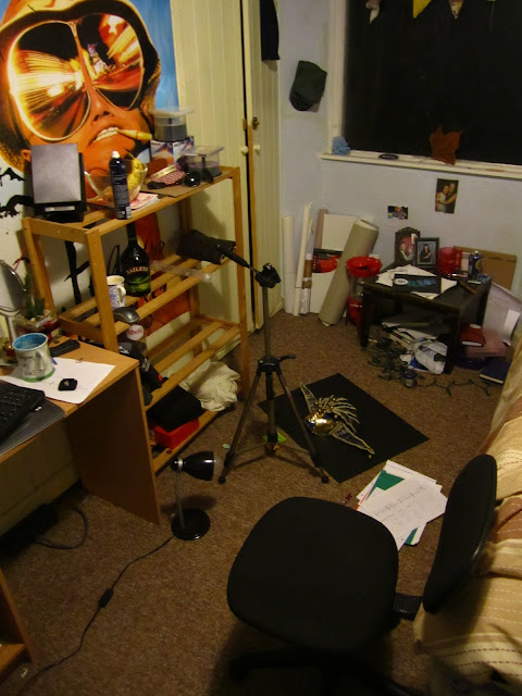
| Me workshop |


